A pull-up banner has only a few seconds to do its job. At a trade show, customers walk past dozens of displays. In a reception area, visitors may glance at it while waiting to be seen. Good pull up banner printing turns that quick glance into a clear message: who you are, what you offer and what people should do next.
That is why the best banner is not necessarily the one packed with the most information. It is the one that looks professional from a distance, stays easy to read up close and travels well from one promotion, meeting or event to the next.
What makes a pull-up banner work?
Pull-up banners are a practical choice for businesses that need strong visual presence without a complicated set-up. The printed graphic rolls neatly into its base, then pulls up and locks into place using a support pole. When the event is over, it packs back down into its carry bag for storage or transport.
For Australian businesses, that portability matters. A sales rep can take one to a client presentation, a café can put one near the counter to promote catering, and an event organiser can use several to create clear branded zones. You get a large-format display without the cost, installation time or storage demands of permanent signage.
The print quality still matters just as much as the convenience. Crisp text, accurate logo colours and a stable banner material help your business look organised and established. A faded image, blurry contact details or a flimsy-looking display can have the opposite effect, even when the service you provide is excellent.
Start with one clear purpose
Before preparing artwork, decide where the banner will be used and what it needs to achieve. This decision shapes the message, the layout and even the best banner size for your space.
A banner for a busy expo should lead with a bold headline and a simple benefit that can be understood from several metres away. A banner used inside a medical practice, real estate office or showroom can include a little more detail because people have longer to read it. Retail promotions often work best with one standout offer, a product image and a clear expiry date where relevant.
Trying to make one banner cover every service, audience and campaign usually creates clutter. If your business attends different events throughout the year, it may be more useful to print separate banners for your main service areas than force everything onto one display.
A strong banner often answers three questions quickly: what do you do, why should someone care, and how can they act? Your business name and logo are essential, but they should support the message rather than take over the whole design.
Pull up banner printing needs readable artwork
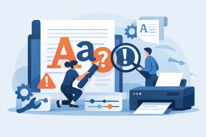
Large-format printing can make artwork issues more obvious, not less. A logo that looks fine on a mobile screen may become pixelated when enlarged. Small type that seems readable in a PDF can disappear once it is viewed from the other side of a foyer or exhibition aisle.
Build the design at the correct banner dimensions wherever possible, using the template supplied for your chosen product. Keep important information away from the edges, the top and the lower section that feeds into the base. That lower area is not the place for a phone number, QR code or key selling point.
Images should be high resolution and supplied at an appropriate size. Avoid stretching a small web image to fill most of the banner. Use vector logos where available, as they retain sharp edges at larger sizes. For photos, choose images with a clear subject and enough quality for print, rather than relying on heavily compressed files copied from social media.
Colour is another practical consideration. Bright on-screen colours can shift when printed, particularly fluorescent tones and very saturated blues or greens. If your brand has specific colour requirements, use your approved logo files and colour values. A professionally prepared PDF is usually the safest file format for production.
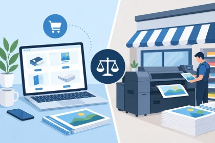
If you have a press-ready file, the ordering process can be straightforward: choose your banner, upload the artwork, check the details and place the order. If something in the artwork is not quite right, getting advice before printing is far better than discovering a problem after delivery. At iPrint Media, customers can speak with the print team when they need help checking files or working through a design issue.
Design for distance, not just the screen
Banner design is less like designing a brochure and more like designing a sign. People should be able to understand the central idea without reading every line.
Use a headline that is short and specific. “Accounting for growing businesses” is clearer than a paragraph about your full suite of solutions. “Fresh lunch specials daily” is more effective for a venue entrance than a dense menu. Let the headline do the hard work, then add only the supporting details needed to move people forward.
Keep body copy brief and give it plenty of breathing room. High contrast is usually your friend: dark text on a light background, or light text on a dark background. Avoid placing text over a busy image unless there is a solid colour panel or sufficient contrast behind it.
Your contact details should be easy to find, but that does not mean listing every platform you use. A website address, phone number or one QR code may be enough. QR codes can be useful for menus, booking pages, product catalogues and lead capture, but test them at realistic scanning distances before approving the artwork.
Choose the right size and placement
Pull-up banners are available in different widths and heights, and the right option depends on the setting. A standard single banner suits many reception areas, pop-up displays and exhibition stands. Wider formats give more impact when the banner needs to carry a larger image or become a key part of a backdrop.
Bigger is not automatically better. In a narrow shop entrance or compact consultation room, an oversized banner can feel crowded and block sightlines. At a larger trade event, however, a small banner can be lost beside neighbouring displays. Think about the available floor space, where people will approach from and the distance at which the message needs to be read.
Placement affects results as much as the print itself. Put the banner where it supports a natural customer journey: beside a registration desk, near a product display, at the entrance to a seminar room or behind a sales table. Do not hide it behind furniture, place it where foot traffic will constantly knock it, or rely on it as the only sign in a visually busy area.
Material and hardware are part of the presentation
A pull-up banner is a reusable marketing asset, so it needs to handle regular transport and set-up. The print material should sit flat, display colour well and resist the curling that can make a banner look tired over time. The base and support hardware should feel stable enough for normal indoor use and straightforward enough that staff can set it up without a manual.
There is a trade-off between the cheapest option and long-term value. If you need a banner for a one-off local event, budget may be the main factor. If it will travel between expos, presentations and branch locations, investing in a well-finished banner can be more economical than replacing a damaged or poor-looking display after a few uses.
Look after the banner once it arrives. Let the graphic retract carefully rather than snapping back into the base. Keep it in its carry bag when not in use, avoid leaving it in direct sun for extended periods and make sure the material is clean and dry before storage. These small habits help preserve colour and keep the display looking presentable.
Make the banner part of a wider print plan
A banner works best when it matches the rest of your physical marketing. Use the same logo treatment, colours and campaign message across flyers, business cards, brochures, table signage or drink coasters where relevant. That consistency helps people recognise your business after the event rather than remembering only a single display.
For a trade show, the pull-up banner can attract attention while flyers provide detail and business cards make follow-up simple. For a hospitality venue, it can promote functions or seasonal offers while table collateral and counter cards reinforce the message. Each item has a different role, but together they create a more professional customer experience.
The most effective pull-up banner is clear, well produced and built around a purpose your audience can understand in seconds. Give it one job, prepare artwork carefully and choose a format that suits the space. When the doors open, you will have a practical display that is ready to represent your business wherever work takes you.