A bright blue logo that looks perfect on a laptop can arrive as a deeper, duller blue on a flyer. A charcoal background can print closer to black than expected. These are the frustrating details businesses want to avoid. The good news is that you can avoid common print colour errors with a few practical checks before your artwork goes to press.
Print is a physical product, not a backlit screen. Colour is affected by your file setup, the stock you choose, the printing process and even the lighting where the finished piece is viewed. Getting these details right protects your brand and helps every business card, menu, banner or promotional flyer look as professional as the business behind it.
Start with CMYK, Not RGB
Most screens display colour in RGB, which uses red, green and blue light. It produces vivid colours because the image is lit from behind. Commercial printing usually uses CMYK – cyan, magenta, yellow and black inks – applied to paper or another printed stock.
That difference matters. Certain RGB colours, particularly electric blues, bright greens, vivid oranges and fluorescent tones, sit outside the range that CMYK inks can reproduce. When an RGB artwork file is converted for print, those colours may shift automatically, sometimes more noticeably than you expect.
Set up your artwork in CMYK from the beginning wherever possible. If your design is already complete in RGB, convert it before finalising the file and review the result carefully. Do not rely on a last-minute conversion at upload, because you lose control of how your brand colours are handled.
For photos, the change can be subtle. For logos, coloured text and large solid backgrounds, it can be much more obvious. If a particular shade is central to your branding, check it in a CMYK file before ordering a large print run.
Use the right colour profile
A CMYK document still needs a suitable colour profile. Profiles give design software instructions for translating colours to a particular print condition. The best profile can depend on the press and stock, so it is worth checking the artwork requirements supplied for your product.
If you are unsure, avoid repeatedly converting the file between RGB and CMYK. Every conversion can alter the colour values. Keep one master artwork file, make a dedicated print version, then export a high-quality PDF from that print version.
Avoid Common Print Colour Errors in Solid Areas
Large blocks of colour show up small problems quickly. A pale grey can look uneven, and a full-page navy or black background can reveal tiny lines, shifts or variations that would be invisible on screen.
For large colour areas, use the CMYK values recommended by your designer or printer rather than choosing a colour by eye. This is particularly relevant for folders, menus, flyers, postcards and pull-up banners, where colour can cover a substantial part of the design.
Black deserves extra attention. Text and fine lines should generally use 100 per cent black only. Building small text from all four CMYK inks can create soft edges if the inks do not align with absolute precision. For a rich black background, a mix of CMYK inks may give a denser result, but it needs to be set up correctly for the product and printing method.
There is a trade-off here. Rich black can look stronger on a broad background, while simple black keeps small details crisp. If your artwork includes both, use each black appropriately instead of applying one setting everywhere.
Match Your Paper Stock to the Result You Want
The same artwork does not look identical on every stock. Gloss stocks usually make colour appear sharper and more saturated, which suits bold promotional flyers, image-heavy marketing and vibrant event material. Uncoated paper has a softer, more natural finish and can absorb ink differently. It is often an excellent choice for letterheads, writable cards and understated professional stationery.
This does not make one option better than the other. It depends on what the item needs to do. A café menu, a premium business card and a property flyer may all call for different finishes even when they use the same logo.
If colour consistency across products is a priority, use comparable stocks and finishes wherever practical. A logo printed on uncoated envelopes will not necessarily have the same visual punch as the same logo on a glossy flyer. That is normal, but it should be a deliberate choice rather than a surprise.
Also consider where the item will be seen. Indoor lighting, daylight and warm venue lighting can all change the way printed colour appears. This is especially relevant for hospitality venues, event signage and point-of-sale material displayed under coloured or low lighting.
Check Images at Their Final Size
Colour and image quality work together. A low-resolution image can make colours look muddy, pixelated or flat, even if its CMYK values are technically correct. For most printed images, aim for 300 dpi at the final printed size.
Do not judge an image only by how it looks when enlarged on screen. A small image stretched across an A4 flyer or a pull-up banner may look acceptable in a browser but break down when printed. Check the placed image dimensions in your design software, not just the pixel dimensions of the original file.
Be careful with screenshots and images copied from websites or social media. They are often optimised for screens, not commercial printing. If a photo is central to your campaign, source the highest-resolution version available before artwork is finalised.
Keep Brand Colours Consistent Across Files
Businesses often build print materials over time: business cards one month, promotional postcards the next, then event banners, magnets and envelopes. Colour inconsistency creeps in when each file uses slightly different logo versions or unrecorded CMYK values.
Create a simple brand reference for print. It should include the approved logo files, CMYK values for core colours, approved typefaces and any notes about preferred stocks or finishes. This gives staff, agencies and designers one clear reference point.
Avoid picking logo colours from a screenshot or entering values manually from memory. A minor difference in magenta or yellow may be hard to spot on screen, but it can be noticeable when two printed items sit side by side at a reception desk, trade stand or sales meeting.
If your brand uses a specific spot colour or an especially vivid corporate shade, discuss the best production approach before ordering. Standard full-colour printing is cost-effective and ideal for many jobs, but some colour requirements need more planning to achieve the closest possible match.
Review PDFs Before You Upload
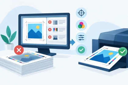
A press-ready PDF is the safest format for most commercial print jobs. Before uploading, open the final PDF rather than reviewing only the design file. Check every page, including the back of double-sided items.
Look closely at logos, fine type, reversed-out text, photos and colour backgrounds. Confirm that the document size is correct and that artwork running to the edge includes the required bleed. Bleed is not a colour setting, but it prevents white trimming edges from interrupting a coloured background or image.
It is also worth checking overprint settings. Overprint can be useful in specialist artwork, but accidental overprint may make objects disappear or cause unexpected colour changes. If you do not understand a setting in your design program, do not assume it will correct itself during production.
When deadlines are tight, a five-minute PDF review can save far more time than a reprint. Read copy aloud, view the file at 100 per cent, and ask a colleague to check it if the job is customer-facing or being printed in volume.
When a Proof Is Worth It
For a small run of basic flyers, a carefully checked PDF is often enough. For a major event campaign, a new brand launch, premium collateral or a job with difficult colours, a proof or professional artwork review can be a wise safeguard.
A printed proof gives you a more realistic sense of how colours, images and stock work together. It is not always necessary, and it can add time or cost, but it is useful where the financial impact of getting it wrong is higher. A venue printing hundreds of menus or an exhibitor preparing large-format display material has more to lose from an avoidable colour surprise.
At iPrint Media, the print team can help when a file needs attention before production. Getting support early is usually quicker and more affordable than discovering an issue after delivery.
Your printed material is often handled before your business gets the chance to speak. Give the file a proper final check, choose stock with purpose, and ask for help when a colour matters. That small amount of preparation helps your brand arrive looking ready for business.