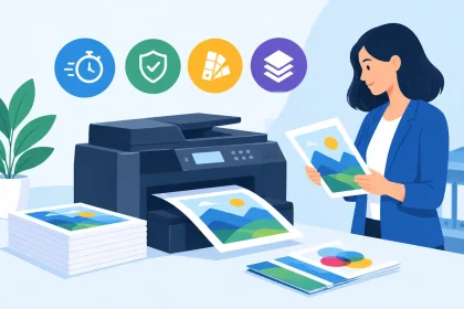
A preflight failure can feel frustrating, particularly when you have a deadline for an event, promotion or client meeting. But when customers ask, “why do files fail preflight?”, the answer is usually straightforward: the artwork contains something that could produce an unexpected result once it reaches the printing press. Preflight is there to catch that risk before paper, ink and production time are wasted.
For business cards, flyers, banners, coasters and other branded print, a small file issue can turn into a noticeable problem. A logo may print blurry, text may sit too close to the edge, or a background colour may leave an unwanted white strip after trimming. Fixing the file before production helps protect your budget, turnaround and brand presentation.
What preflight checks in a print file
Preflight is an automated check performed on artwork before it moves into production. It examines whether a PDF meets the technical requirements for the selected product and print process. Think of it as a final quality check for the file itself, not a judgement on the design.
The check commonly looks for page size, bleed, crop marks, image resolution, fonts, colour settings and missing elements. Some warnings are minor and can be reviewed by a print professional. Others stop the job because the risk of a poor print result is too high.
A PDF that looks perfect on a laptop screen can still fail preflight. Screens display artwork using light and can hide issues that become obvious when ink is placed on stock, trimmed to size or viewed from arm’s length. This is why a print-ready PDF is different from a document that simply looks ready to print.
Why do files fail preflight most often?
Most failures come down to a handful of common artwork set-up issues. They are usually easy to prevent once you know what to look for.
The artwork is the wrong size
Every printed product has a finished size. A standard business card, for example, needs to be supplied at the correct dimensions for the chosen format. If the PDF page is too large, too small or has an unusual proportion, the artwork may not align with the production template.
This often happens when a design is created in a general document program rather than print design software. It can also happen when an A4 flyer is resized to A5 by stretching the page instead of rebuilding the file at the required dimensions.
Always set your document to the final product size before designing. If you are unsure, check the product specifications first rather than guessing from an image preview.
Bleed is missing or set up incorrectly
Bleed is extra artwork that extends beyond the finished trim edge. It is normally 3 mm on each side, although requirements can vary by product. It gives the guillotine room for slight movement during trimming, so colour and imagery run cleanly to the edge.
Without bleed, a full-colour background, border or photo may finish with a fine white line along one side. That line is not a printing fault. It is the result of artwork stopping exactly at the edge while the finished piece is trimmed.
If your design has a white background, bleed may not appear necessary. If any colour, photograph or pattern touches an edge, however, extend it into the bleed area. Do not stretch only the page size – extend the background elements themselves.
Important text sits too close to the edge
Bleed protects the outside of the design, while the safe area protects what matters inside it. Names, phone numbers, QR codes, pricing, logos and legal details should sit comfortably inside the trim line.
A file can fail preflight, or require manual attention, when important elements are too close to an edge. Even if nothing is cut off, the finished item can look cramped or uneven. This is especially noticeable on business cards, coasters and small-format flyers where every millimetre counts.
As a practical rule, keep key content at least 3 mm inside the finished edge unless the product template advises otherwise. Avoid thin borders close to the edge too. They can make perfectly normal trim variation look more obvious.
Images are too low resolution
Images downloaded from social media, copied from websites or taken from an old presentation are often too small for commercial printing. They may look sharp on screen but print soft, pixelated or blocky.
For most printed products, images should be supplied at around 300 dpi at their final placed size. The key phrase is final placed size. A 300 dpi image that is enlarged significantly in the layout will no longer have enough detail for a crisp result.
Preflight can identify low-resolution images, but it cannot create missing detail. Replacing the image with the original high-resolution photograph, a properly sized licensed image or vector artwork is the right fix. Simply increasing the dpi number in an image editor will not improve the quality.
Fonts have not been embedded or outlined
Fonts can cause unexpected substitutions if the original typeface is not included in the PDF. A different font may alter line breaks, spacing and the position of text. In a tight layout, that can push content into the trim area or cover other elements.
Exporting a proper print PDF generally embeds fonts automatically. If the software gives you the option, embedding is usually preferable because it retains editable text behaviour in the file. Converting text to outlines can also prevent font substitution, but it means the text is no longer editable and can make late spelling corrections harder.
Before exporting, check spelling, phone numbers, website addresses and offer dates. Once text is outlined, you will need to return to the original artwork file to make changes.
Colours are not prepared for print
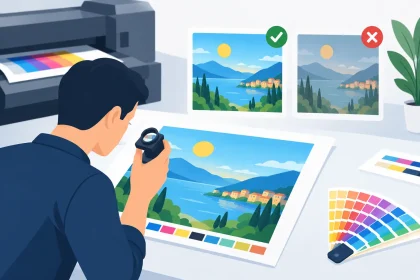
Digital screens use RGB light, while commercial print uses CMYK inks. This difference does not always cause a preflight failure, but it can trigger a warning or lead to colour that looks different from the screen version.
Bright blues, greens and fluorescent-style colours are the usual surprise. Some colours available in RGB cannot be reproduced exactly with standard CMYK printing. A brand colour may need careful conversion, or a different production method may be needed where precise colour matching is essential.
Set up artwork in CMYK from the start where possible. If your organisation has established brand colours, use the correct CMYK values supplied in your brand guidelines. For a first print run or a colour-critical campaign, a proofing discussion is worth having before ordering a large quantity.
The PDF contains layers, transparency or unsupported elements
Modern design software makes it easy to use transparent shadows, blend modes, clipping masks and layered effects. These can look excellent, but certain export settings may flatten them poorly or interpret them differently in production software.
The safest approach is to export using the print PDF setting recommended by your printer. Avoid supplying source files, screenshots, Word documents or a PDF created through a basic office print command when a press-ready PDF is required. Those formats can change image quality, colour settings and font handling without making the changes obvious.
How to prevent a preflight problem before upload
The quickest way to avoid delays is to build the artwork to the product specification from the beginning. Start with the correct template or document size, add the required bleed, and keep vital content within the safe area. Export a high-quality PDF rather than relying on a low-resolution preview.
Before uploading, open the final PDF and inspect it at 100 per cent zoom. Check every page, not just the first one. Look closely at small text, QR codes, fine lines, photo edges and any design elements that reach the trim line. Confirm that the PDF page count matches the product you are ordering, particularly for double-sided cards, folded pieces and multi-page documents.
A short final check can save more time than a rushed upload. Ask yourself whether the logo is sharp, whether the contact details are current, whether the size is correct and whether the background extends into the bleed. If the answer is unclear, it is better to ask before production begins.
What happens when your artwork fails preflight?
A failed preflight result does not mean your design is unusable. It means the file needs attention before it can be produced reliably. The exact next step depends on the issue. A missing bleed may be a quick adjustment in the original artwork, while low-resolution imagery may require a replacement file.
Do not make changes only to the PDF if you still have the original design file. Edit the source file first, then export a fresh PDF. This keeps the artwork clean and avoids creating new issues through repeated PDF edits.
If you are not confident working in design software, send the file through for review rather than taking a guess. At iPrint Media, the print team can help identify what is holding the file up and explain the practical fix. That support is particularly useful when an event date, opening promotion or sales campaign cannot move.
Your printed materials often meet customers before you do. Taking a few extra minutes to clear preflight checks helps ensure the business card handed over at a meeting, the flyer placed on a counter or the banner displayed at an event looks as professional as the business behind it.