A business card is often handled before anyone hears your pitch. Its weight, surface and finish quietly tell a customer whether your business is polished, practical, premium or creatively different. That is why choosing the best card stocks is not just a production detail. It is a branding decision that affects how your card looks, feels and performs once it is in someone’s wallet, on a counter or passed around at an event.
For most Australian businesses, the right choice comes down to three things: the impression you want to make, how the card will be used, and the budget you need to work within. A thick stock can feel substantial, but a textured surface may better suit a boutique brand. A glossy finish can make colours pop, while an uncoated card is often easier to write on. The best option depends on the job.
What makes a business card stock worth choosing?
Card stock refers to the heavier paperboard used for items such as business cards, postcards and presentation cards. It is usually described by gsm, or grams per square metre. As the gsm increases, the stock generally becomes thicker and firmer, although the exact feel can vary between paper types.
For business cards, 350gsm is a popular starting point because it provides a professional weight without becoming overly bulky. It is a reliable choice for day-to-day networking, staff cards, appointment cards and promotional handouts. It gives customers something more substantial than ordinary office paper and holds print detail well.
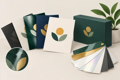
The finish matters just as much as the weight. A smooth coated stock supports crisp images and strong colour reproduction. An uncoated stock has a more natural, tactile surface and is practical where customers need to write notes, appointment times or contact details. Textured and recycled options can bring personality to the card, but they need artwork chosen with the paper surface in mind.
Best card stocks for different business goals
There is no single stock that suits every brand. A tradie handing out cards on site has different needs from a wedding stylist, accountant, café owner or real estate agent. Choosing with the end use in mind prevents paying for features that do not add value, or selecting a stock that does not support your message.
350gsm smooth stock for everyday professional cards
A smooth 350gsm card is one of the most practical choices for small businesses and professional services. It has enough body to feel quality in the hand, while remaining affordable for larger quantities. Clean logos, contact details, fine lines and full-colour graphics reproduce clearly on a smooth surface.
This is a strong all-round option for consultants, builders, salons, sales teams, medical practices and local retailers. If you need cards quickly for a trade show, new staff member or customer meeting, a standard premium stock is usually the safest place to start. It is familiar, professional and flexible enough for most brand styles.
Matte or silk stock for a clean, modern look
Matte and silk finishes offer a refined appearance without the shine of gloss. They work particularly well for businesses with minimal branding, darker colour palettes, architectural imagery or elegant typography. A matte surface can make a card feel modern and understated, while silk offers a soft, smooth finish with a little more polish.
These finishes are useful where readability matters. Strong contrast between text and background is still essential, but matte and silk stocks reduce glare under office lights, at conferences and in cafés. They also tend to suit corporate, property, legal, finance, design and professional service brands that want to look considered rather than flashy.
The trade-off is that very dark solid colours can sometimes show scuffs more easily, especially if cards are carried loose in a pocket or handbag. A good design with sensible coverage and a suitable protective finish can help.
Gloss stock for vivid colour and visual impact
Gloss card stock is designed to catch the eye. It enhances bright colours, photographs and high-contrast graphics, making it a useful choice for hospitality, retail, entertainment, events and promotional campaigns. If your card features food photography, product imagery, bold illustrations or a colourful offer, gloss can help those elements stand out.
It is less suited to cards that need handwritten notes, as pen may smudge or take longer to dry on a coated glossy surface. For a restaurant loyalty card, an appointment card or anything customers are expected to write on, consider an uncoated reverse side or a more writable stock instead.
Uncoated stock for handwritten details and natural branding
Uncoated card stock has a softer, more absorbent finish. It is a practical pick for appointment cards, loyalty cards, referral cards and service businesses that write booking details by hand. Pens and stamps generally perform better on an uncoated surface than on a heavily coated one.
It also has a warm, natural feel that can complement wellness businesses, cafés, florists, photographers, makers and community-focused brands. The surface can make colours appear slightly less glossy and less intense than on coated stock, so artwork may need to be adjusted to achieve the intended result. That is not a drawback when it is part of the look you want. It simply means the design and stock should be chosen together.
Recycled stock for brands with an environmental focus
Recycled card stock helps communicate an environmental or locally minded brand position through the material itself. Its fibres, tone and slight variations can create an honest, crafted appearance that feels right for sustainable retailers, ethical product businesses, accommodation providers, community organisations and food venues.
Be realistic about the visual outcome. Recycled stocks may not produce the same sharp white background or highly saturated colour as a bright coated stock. Fine type should be kept clear and legible, and very pale colours can disappear into the natural paper tone. When the material supports your values, those characteristics can become part of the appeal rather than a compromise.
Textured and specialty stocks for premium presentation
Textured card stocks add another sensory layer to your business card. Linen, laid and other embossed surfaces can make a simple logo feel more premium, particularly when paired with restrained design. These stocks suit boutique professional services, luxury accommodation, beauty providers, wedding suppliers, artists and high-end retail brands.
They are most effective when the design does not fight the texture. Large areas of dense print, tiny reversed text and highly detailed images can lose clarity on a pronounced surface. A strong logo, generous spacing and a confident typeface usually deliver a better result.
Choosing the right weight: is thicker always better?
Thicker is not automatically better. A heavyweight card can create a memorable first impression, but it should still feel practical for the person receiving it. Extremely thick cards can be difficult to store in a standard wallet, expensive to produce in volume and unnecessary for a straightforward staff contact card.
For many businesses, 350gsm offers the right balance of quality, price and usability. Stepping up to a heavier stock makes sense when the card is part of a premium brand experience, used for a special launch or designed to be kept as a voucher, gift card or invitation. If budget is tight, a well-designed card on a quality 350gsm stock will often look more professional than a thicker card with crowded artwork.
Match the artwork to the stock
The best card stock can only do so much if the artwork is not set up correctly. Keep essential text away from trim edges, use high-resolution images and make sure small type is large enough to remain readable after printing. Very fine lines, pale text and low-contrast colours need extra care, especially on textured, recycled or uncoated materials.
Think about what happens after the card leaves the box, too. Will a customer write on it? Will it sit on a café counter? Will staff carry it on site? Will it be handed out at a busy expo? These answers can point you towards the best surface and finish faster than simply selecting the heaviest option.
A two-sided design is often worth considering. Use one side for clear contact details and the other for your service message, booking prompt, QR code or offer. Just avoid trying to fit every service, social handle and slogan into a small space. White space makes a card easier to scan and gives the stock room to make an impression.
A practical way to choose your business card stock
Start with your brand position. If you want a dependable, professional card for daily use, choose a smooth 350gsm stock. If you need rich colour and imagery, look at gloss. If customers need to write on the card, uncoated is usually the better fit. If your business is built on premium detail, sustainability or a handmade feel, textured or recycled options may better reflect what you do.
Then consider quantity and timing. Standard stocks are often the most cost-effective choice for larger staff runs or event handouts, while specialty stocks are ideal for smaller, high-impact orders. If you are uncertain how your PDF artwork will print on a particular material, getting a print team to check the file before production can save time and avoid an expensive reprint.
At iPrint Media, the aim is simple: help you produce a card that represents your business properly, without making the ordering process harder than it needs to be. Choose a stock that suits the way your customers meet, remember and return to your brand – then let clear artwork and quality printing do the talking.