A glossy flyer can make a sale price jump off the page. A textured letterhead can make the same business feel established before a word is read. That is the practical difference behind coated versus uncoated paper: the stock changes how your design looks, feels and performs in a customer’s hands.
Choosing paper is not a minor production detail. It affects colour strength, readability, writing ability, durability and the impression your brand leaves. The right option depends on what you are printing, where it will be used and what you need it to do.
Coated versus uncoated paper at a glance
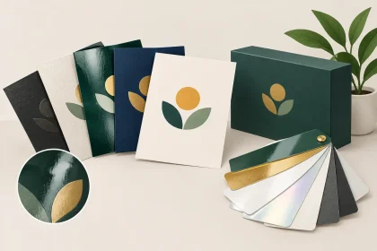
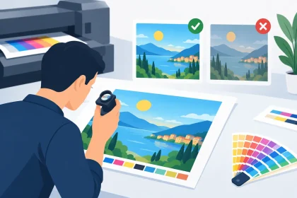
Coated paper has a surface treatment, usually a clay-based coating, that creates a smoother finish. Because ink sits closer to the surface rather than soaking deeply into the sheet, images and colours generally appear sharper and more vibrant. It is available in gloss, matte and silk-style finishes, each with a slightly different look.
Uncoated paper has no surface coating. It is more natural to the touch, often with a little more texture, and absorbs ink more readily. Colours can appear softer than they do on coated stock, but the finish has a tactile, understated quality that suits many professional and premium applications.
Neither is automatically better. A café menu, real estate flyer and promotional postcard have different jobs from a letterhead, appointment card or handwritten order form. Good print begins by matching the stock to that job.
When coated paper is the better choice
Coated paper is often the practical choice when strong imagery, crisp graphics or rich brand colours are the priority. It gives photos more contrast and can make coloured backgrounds appear cleaner and more even. For businesses promoting a product, event or offer, that extra visual impact can matter.
Gloss coated paper has a noticeable shine. It is well suited to image-heavy flyers, postcards, event promotions and marketing pieces where you want colour to feel bright and energetic. The trade-off is glare under direct lighting and the fact that gloss can show fingerprints more easily, particularly on dark designs.
Matte coated paper is smoother and less reflective. It still delivers good colour and clean detail but has a more restrained, modern appearance. It is a strong option for premium business cards, brochures, presentation material and branded collateral that will be handled regularly. Matte finishes also make small text easier to read in bright venues or office lighting.
Silk or satin-style coated stocks sit between gloss and matte. They have a subtle sheen, dependable colour reproduction and a smooth feel without the high shine. If you want a polished finish but are not sure whether gloss will suit your design, a silk-style option is often a safe middle ground.
Coated stock is especially useful for projects with product photography, detailed illustrations, solid colour blocks or fine logos. Hospitality venues can use it for promotional flyers or takeaway inserts, while retailers may prefer it for sale cards and product handouts. The surface helps your artwork look deliberate and professionally finished.
A note on writing and folding
Coated paper is less absorbent, so standard pens can take longer to dry on it. If customers, staff or guests need to write directly on the item, uncoated stock is usually easier to use. This matters for appointment cards, forms, vouchers that need signing and feedback cards.
For folded brochures and heavier coated cards, the fold may need scoring before folding to avoid cracking along a dark-coloured edge. It is a normal production consideration, not a reason to avoid coated paper. It simply shows why selecting the right stock and finish early helps deliver a better result.
When uncoated paper makes more sense
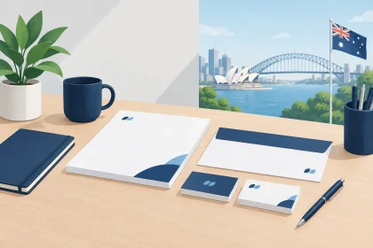
Uncoated paper has a warmer, more natural feel. It is a popular choice for business stationery because it looks professional without feeling overly glossy or promotional. Letterheads, envelopes, compliment slips and forms all benefit from its writing-friendly surface.
Ink absorbs into uncoated fibres, which gives printed colours a softer result. That can be exactly what a brand needs. Professional services, community organisations, wellness businesses and independent retailers often choose uncoated stocks when they want their printed materials to feel approachable, considered and less sales-driven.
It is also a smart choice where function matters as much as appearance. A staff member can jot down a note on an uncoated notepad. A client can sign a form without ink smudging. An envelope can be labelled or written on with ease. Those small details make a difference once print collateral is out in the real world.
Uncoated paper is not limited to plain office stationery. A well-designed uncoated business card can feel particularly premium because of its texture and weight. It can suit brands that use minimal layouts, fine typography, muted colours or a more tactile identity. Think accountants, architects, legal firms, consultants, boutique accommodation and local makers.
Colour expectations on uncoated stock
The key is to set the right expectation. Bright photos and heavily saturated colours will not have the same punch as they do on gloss or silk coated stock. On uncoated paper, they can look more muted because the ink is absorbed into the sheet.
That does not mean the print is lower quality. It means the finish is different. If precise brand colour is essential, or your artwork relies on vivid photography, coated stock will often be the safer option. If the aim is a softer, tactile and confident finish, uncoated may better represent your brand.
Choose stock based on how customers use it
The most useful question is not, “Which paper is best?” It is, “What will happen to this item after it is printed?” A flyer picked up at a trade show needs attention-grabbing colour. A letterhead sent with a proposal needs to accept handwriting and look credible. A drinks coaster needs absorbency, while a pull-up banner needs a material designed for visibility and durability rather than paper stock alone.
For business cards, both finishes work well. Choose coated for vivid logos, photographs and bold colour. Choose uncoated when you want a more tactile card or need space for a handwritten appointment or note. A matte coated card is often a practical all-rounder for businesses seeking sharp print with a refined, low-glare finish.
For flyers and postcards, coated paper is generally the stronger choice when the design includes promotional photography, menu images or colourful event details. For letterheads and envelopes, uncoated stock is usually the natural fit because it prints cleanly and is easy to write on.
For hospitality businesses, the decision can vary by item. Promotional table cards, takeaway flyers and loyalty cards may benefit from coated stock. Order pads, booking forms and internal stationery usually work better uncoated. The same logic applies to event organisers: use coated pieces to promote the event, and uncoated pieces where attendees or staff need to write.
Your artwork affects the decision too
Before choosing a finish, look at the artwork honestly. A design with high-resolution photos, gradients, large areas of dark colour and bright branding is usually built for coated paper. A design with lots of fine text, gentle colour palettes and plenty of white space may look excellent on uncoated stock.
Black deserves special attention. Large black areas on gloss or matte coated paper can look rich and dramatic, but fingerprints and small scuffs may be more visible. On uncoated stock, black can look softer and less dense. If your design depends on deep, solid black, ask for advice before ordering a large run.
Paper weight matters as well. A heavier stock generally feels more substantial, but it should still suit the purpose. A thick business card creates a strong first impression. A bulky flyer can be unnecessary if you are distributing thousands at an event. Balance presentation, budget and practicality rather than choosing the heaviest option by default.
Get the finish right before the presses run
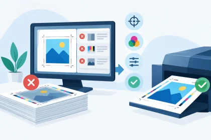
A screen cannot fully replicate the feel of paper or the way a finish responds to light, so it helps to think beyond the PDF. Consider where the item will be displayed, whether people will write on it, how often it will be handled and whether colour or texture is doing more of the brand work.
If you already have press-ready artwork, select the stock that supports its purpose. If you are unsure, getting a second opinion before production is far easier than being disappointed after delivery. At iPrint Media, the team can help flag practical artwork and stock considerations so your finished print is fit for purpose.
The best paper choice is the one that makes your message easier to notice, easier to use and more credible in the hand. Start with the customer experience you want to create, and the coated or uncoated decision becomes much clearer.