A handshake, a quick chat at a trade show, a quote discussion at a customer’s site – these are the moments when business cards earn their place. A well-made card gives someone a physical reminder of who you are, what you do and how to get in touch when they are ready.
For Australian businesses, the best card is not necessarily the flashiest one. It is the one that feels considered, reflects the standard of your work and makes your contact details easy to find. Whether you are a sole trader, café owner, sales professional or event organiser, the right choices in stock, layout and finish can turn a small piece of print into a useful sales tool.
What good business cards need to do
A business card has limited space, so every element needs a job. It should introduce your brand quickly, give people a clear way to contact you and leave a positive impression that lasts beyond the conversation.
Start with the essentials: your name, business name, role, mobile number, email address and website or relevant social handle. Add your logo and a short description of your service only if it helps the reader understand what you offer. A card crowded with every service, accreditation and slogan can be harder to use than a simple, confident design.
Think about where the card will be handed out. A mortgage broker meeting clients in person may benefit from a polished, professional look with plenty of white space. A restaurant or bar might use bolder colour, an illustrated reverse side or a booking prompt. A trades business may prioritise a prominent phone number and a concise list of core services. The right approach depends on your customers and the setting.
Choose business cards that match your brand
Your card should feel like part of the same business customers see on your signage, vehicle graphics, uniforms, invoices and social channels. Consistency builds recognition. If your logo uses particular colours, typefaces or visual elements, carry them through to the card rather than starting again with a different style.
That does not mean every card needs a dark background, heavy colour coverage or decorative effects. Minimal designs can look premium when the typography, spacing and print quality are right. On the other hand, a vibrant design can work brilliantly for a retail brand, creative studio or event business where personality is part of the offer.
The key is legibility. Use strong contrast between text and background, keep fine type large enough to read, and avoid placing important information over busy photos or patterns. If someone has to squint to find your phone number, the design is not doing its job.
Keep the front and back purposeful
A common and effective format is to use one side for your logo and visual identity, then reserve the other for contact information. This gives the design room to breathe and stops your details competing with your branding.
The reverse side can also work harder. Depending on your business, it may include a QR code, appointment reminder, opening hours, loyalty offer, short service list or a simple call to action. Just make sure the extra content has a clear purpose. A QR code is useful when it takes customers to a relevant page or makes saving your details easier, not when it is added simply because there is space.
Stock and finish change how your card is received
People notice how a card feels. A flimsy card can unintentionally suggest a rushed or low-value service, while a substantial stock feels more considered and is more likely to survive a wallet, bag or desk drawer.
A smooth matte finish is a practical choice for many professional services businesses. It gives a clean, modern appearance and reduces glare, which helps with readability. Gloss can make colours and images appear more vivid, making it a useful option for brands with strong photography or bright visual elements. Uncoated stock has a natural, tactile feel and can be especially suitable where customers may need to write notes on the card.
There are trade-offs. Dark backgrounds can look striking but may show scuffs more readily after frequent handling. Heavy ink coverage and complex finishes can create a premium result, but they may not be necessary for every order or budget. Choose the finish that supports your brand and the way your cards will be used.
Standard or custom shape?
Standard rectangular cards remain popular because they fit neatly in wallets and card holders, are easy to store and present a familiar professional format. For most businesses, a standard size with excellent artwork and quality stock will outperform an unusual shape with unclear information.
Custom shapes, rounded corners or folded cards can be worth considering when they reinforce the brand or provide a genuine practical advantage. A venue may use a folded card as a compact function guide, while a photographer may use a distinctive format to showcase imagery. If you go beyond the standard shape, keep the card practical enough that recipients will want to hold onto it.
Prepare artwork that prints cleanly
The difference between a good design on screen and a good printed card often comes down to artwork setup. Commercial printing works best with a press-ready PDF that is correctly sized, high resolution and set up with bleed where required.
Bleed is the extra image area beyond the trim edge. It allows colour or photos to run cleanly to the edge of the finished card without leaving unwanted white slivers. Keep text, logos and important details safely inside the trim area too, so they are not placed too close to the edge.
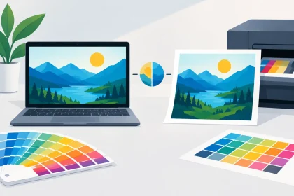
Use high-resolution images and avoid screenshots, social media graphics or small web images that may look sharp on a mobile but print poorly. Colours can also appear different in print than on a bright screen, particularly very vivid blues, greens and neon shades. A print-ready file built for print production gives you more predictable results.
If you are not confident with artwork requirements, ask for help before placing the order. It is far easier to fix a file before production than to discover a spelling error, low-resolution logo or missing bleed once cards have been printed. At iPrint Media, customers can upload a press-ready PDF or speak with the print team when their files need attention.
Order the right quantity for your business
It is tempting to order the largest quantity available to reduce the per-card cost. That can make sense for a stable brand with established details, but only if the information is unlikely to change soon.
If you are updating your branding, moving premises, adding staff or trialling a new offer, a smaller run may be the smarter call. Ordering too many cards with an old address or outdated role creates waste and can cause confusion. For businesses with steady contact details and regular face-to-face sales activity, a larger quantity provides better value and ensures you are never caught without cards before an event or client meeting.
Consider how cards are used across your team. Sales staff, reception teams, account managers and site supervisors may all need personalised versions. Keeping the core design consistent while changing names and direct contact details maintains a professional look without making the ordering process complicated.
Make every handover count
Print quality matters, but the handover matters too. Do not leave cards in a stack by the register and hope people take one. Offer a card when the conversation has created a reason for follow-up: after providing a quote, confirming an appointment, discussing a service or meeting someone at an event.
A brief, natural prompt gives the card more value. You might say, “Here are my details in case you need anything further,” or “My direct number is on there if you would like to talk through the quote.” It is simple, but it connects the printed card to the next action you want the customer to take.
Keep cards clean, current and easy to reach. Store a small supply in your wallet, work bag, vehicle or reception area, and replace them when stock is getting low. A card that is bent, marked or pulled from the bottom of a cluttered glove box does not represent the care you put into your work.
Business cards remain one of the most affordable ways to put your brand directly into a customer’s hand. Give them a clear message, quality materials and contact details worth keeping, and they can continue working for your business long after the meeting ends.