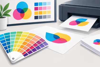
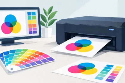
A business card can feel sharp and premium before anyone reads a single word. A café menu can withstand a busy Saturday service, or quickly look tired after a few spills. That difference often comes down to printing paper stocks. The right stock supports your brand, your budget and the way customers will actually use the finished piece.
Paper choice is not just a production detail to tick off at checkout. Weight, finish, thickness and coating all affect colour, readability, durability and the impression your business leaves behind. The best option depends on what you are printing, where it will be handled and what you need it to achieve.
What are printing paper stocks?
A paper stock is the material used to print your job. It is usually described by its weight in GSM, short for grams per square metre, as well as its finish. In simple terms, GSM gives you a useful indication of how substantial the paper will feel. A higher number generally means a thicker, heavier sheet, although thickness can also vary between paper types.
For most business print, you will come across uncoated, silk or matt coated, and gloss coated stocks. Each one handles ink differently and creates a different finish in the hand. There is no single best stock for every job. A polished real estate flyer, a professional letterhead and a set of drink coasters all have very different requirements.
Start with how the piece will be used
Before comparing paper weights, think about the practical life of the item. Is it posted in an envelope, handed out at an event, displayed on a counter or handled repeatedly throughout the day? A flyer promoting a one-week special can often use a lighter stock than a corporate capability statement intended to stay on a prospect’s desk.
Business cards need enough body to feel credible and resist bending in wallets and card holders. Letterheads need to pass through office printers cleanly while still looking professional. Menus, vouchers and event cards may need a more durable finish because they are touched often. If an item needs to survive moisture, frequent handling or outdoor conditions, paper may not be the right material at all. Synthetic stock or another specialised option could be worth discussing with your printer.
The goal is not to choose the heaviest option by default. Heavy stocks can look excellent, but they cost more to produce and post. They may also be impractical for folded pieces or large mail-outs. Choose the material that makes commercial sense for the job in front of you.
Paper weight: what GSM means for your print
For everyday office correspondence, lighter paper is often appropriate. It is easy to fold, economical for volume runs and suitable for invoices, letterheads and internal documents. A branded letterhead should still feel tidy and dependable, but it does not need the same weight as a premium business card.
Mid-weight stocks are popular for flyers, brochures, postcards and promotional inserts. They offer more substance than standard office paper without making distribution unnecessarily expensive. For a local promotion, product launch or event handout, this range often gives a strong balance of quality and value.
Heavier stocks are commonly used for business cards, invitation-style pieces, presentation cards and premium marketing collateral. They feel more substantial, tend to lie flatter and can make a simple design look considered. That said, a very heavy stock is not automatically more professional. A finance firm may suit a clean, uncoated card with a refined finish, while a nightclub promotion might benefit from a glossy stock that makes high-contrast imagery and colour pop.
A quick guide to common applications
Around 80 to 120 GSM is generally suited to letterheads, forms and inserts. Around 130 to 170 GSM is a practical range for flyers and folded brochures. Around 250 to 350 GSM is commonly chosen for business cards, postcards, presentation cards and other pieces where a premium feel matters.
These are useful starting points rather than hard rules. Folding, finishing, print coverage and delivery method can all change the best choice. If you are unsure, it is better to ask before ordering than to discover that a stock is too light, too bulky or unsuitable for your artwork.
Choose the finish to suit your design
Paper finish has a major impact on how colours and images appear. It also affects how easy the printed piece is to write on, how it photographs and whether fingerprints show.
Uncoated paper
Uncoated paper has a natural, non-shiny surface. It is easy to write on, which makes it a sensible option for letterheads, appointment cards, loyalty cards and forms. It can also create a warm, tactile look for professional services, wellness brands, boutique retail and businesses wanting a less promotional feel.
Because uncoated paper absorbs more ink, colours may appear softer than they do on coated stock. Fine detail still prints well with properly prepared artwork, but large areas of dark colour can look different to the same design on gloss. This is not a flaw – it is part of the stock’s character. Just make sure it suits your brand expectations.
Silk or matt coated paper
Silk and matt coated stocks offer a smooth surface with little or no shine. They are a flexible choice for brochures, folders, flyers and business cards because they reproduce colour well while keeping text comfortable to read.
A matt finish is particularly useful for designs with lots of copy, subtle photography or a polished corporate style. It feels modern and understated. The trade-off is that very dark solid areas can show marks more readily than on some glossier finishes, especially on frequently handled items.
Gloss coated paper
Gloss stocks have a reflective finish that helps photographs, bold graphics and vibrant colours stand out. They work well for promotional flyers, product postcards, hospitality offers and image-led marketing. If your design relies on food photography, retail products or colourful event artwork, gloss can add energy.
The shine can create glare under bright lights, and writing on gloss is less convenient. For that reason, it is usually not the first choice for forms, appointment reminders or anything requiring a handwritten note.
Match stock to your brand, not just your logo colours
Your printed materials should feel like they belong together, even when their purposes are different. A crisp, premium business card followed by a thin, dull brochure can create an uneven brand experience. That does not mean every item needs the same GSM or finish. It means the choices should feel intentional.
Consider the message your business needs to send. A law firm, accountant or consultant may prefer uncoated or matt stock for a calm, credible look. A restaurant may choose vivid, wipe-friendly menu materials alongside textured loyalty cards. A trades business might prioritise a tough, clear flyer stock that travels well in a ute, tool bag or site office.
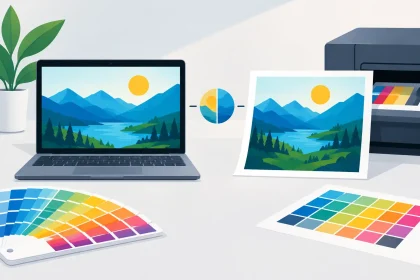
Colour matters too. Bright brand colours generally appear richer on coated stocks, while neutral palettes, fine linework and restrained typography can look excellent on uncoated paper. If colour accuracy is critical, use a professionally prepared PDF and speak with the print team about the finish before committing to a large run.
Do not overlook folding, finishing and delivery
Paper stock affects what can happen after printing. Heavy card can crack along a fold if it is not correctly scored first. A folded menu or brochure needs a stock that opens neatly and holds its shape. Coating, lamination and special finishes can add durability and visual impact, but they also change the final cost and production time.
Think about delivery and distribution as well. A lightweight flyer is easier to post in bulk and cheaper to hand out at a busy event. A heavier postcard may be more memorable, but it can increase postage and courier costs. For a targeted campaign to high-value clients, that investment may be worthwhile. For 10,000 letterbox drops, a practical mid-weight stock may deliver better value.
Get the artwork right for the chosen stock
A great paper choice cannot rescue a low-resolution logo, incorrect bleed or poorly set-up PDF. Supply artwork at the correct finished size with bleed where required, keep important text safely inside the trim area and use high-resolution images. Small details matter more on premium stocks because customers will naturally inspect them more closely.
If your file is not press-ready, get it checked before production. A quick conversation can prevent common issues such as unexpected colour shifts, thin borders trimming unevenly or text sitting too close to the edge. iPrint Media can help you choose a practical stock and identify artwork concerns before they become an expensive reprint.
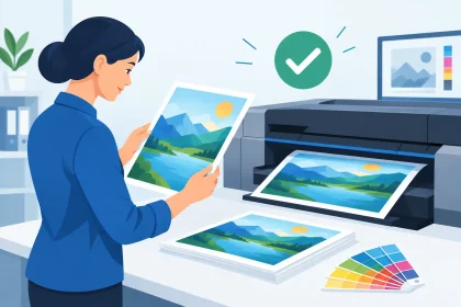
The right paper should make your message easier to notice, handle and remember. Start with the purpose of the piece, choose a finish that supports the design, then select a weight that feels right for your audience and budget. When those decisions work together, even a simple printed item can do a much better job for your brand.