A business card that needs to be handed out tomorrow, a banner for a Friday event or coasters for a busy venue cannot sit in an artwork queue for days. When you upload print artwork correctly the first time, production can get moving quickly and your order stays on track.
The good news is that you do not need to be a print expert to supply a strong file. You simply need to prepare it for the finished size, allow for trimming and make sure the images and text will reproduce clearly. A press-ready PDF is usually the most reliable choice, but a few quick checks before uploading can prevent the most common delays.
Upload Print Artwork That Is Ready for Production
Your artwork file is the instruction sheet for the finished product. It tells the printer where colours, images, logos and text should appear. If the file is set up at the wrong size, uses low-resolution images or has important copy too close to an edge, the printed result may not match what you expected.
Start by confirming the product specifications before you design. A standard business card, A5 flyer, DL envelope and pull-up banner each have different finished dimensions. For larger products such as banners, artwork can sometimes be supplied at scale, but only where the required specifications allow it. Designing to the correct size from the beginning is easier than trying to resize a finished file at the last minute.
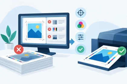
For most commercial print jobs, save and upload a high-quality PDF. PDFs hold text, layout and graphics together, helping avoid changes that can occur when working files are opened on another computer. They are also typically smaller and more stable than sending an editable design file with separate fonts and image folders.
Before submitting your order, check these essentials:
- Set the artwork to the product’s finished size, including the required bleed.
- Keep text, logos and key details inside the safe area.
- Use high-resolution images, ideally 300 dpi at their placed size.
- Export colours in CMYK where possible, rather than relying on RGB screen colours.
- Review every page of the final PDF, including the back of double-sided products.
These checks are simple, but they protect the parts of your job that matter most: your brand, your deadline and your budget.
Why bleed and safe areas matter
Commercial print sheets are trimmed after printing. While cutting equipment is highly accurate, there is a small tolerance in every production run. Bleed gives the cutter extra background image or colour beyond the final edge, so a coloured border or photo reaches all the way to the trim line.
As a general guide, a 3 mm bleed is common for smaller printed pieces such as flyers, business cards and postcards. If your background is white, bleed may be less noticeable, but it is still best to follow the product artwork requirements. For wide-format products, the required allowance can differ, so use the specification supplied for that item.
The safe area works in the opposite direction. It is an internal margin that keeps important information away from the edge. A phone number placed too close to the trim line can look cramped or, in a worst-case outcome, be partly cut off. Keep your logo, contact details, pricing and call to action comfortably inside the safe area. This is particularly valuable on business cards, where a few millimetres can make a big visual difference.
Getting Colour Right Before You Upload Print Artwork
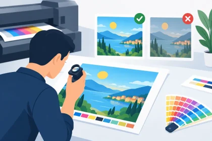
A screen produces colour with light. Print creates colour with ink on paper, card or another material. That difference is why a bright electric blue on a laptop may appear a little deeper once printed, or why a fluorescent-looking green may not reproduce exactly as it appears on a mobile screen.
If colour is central to your brand, build your file in CMYK and use approved CMYK or Pantone values where relevant. RGB images can be converted for print, but the conversion may shift certain colours. This does not mean RGB files cannot be printed. It means the final result can be less predictable, especially with very vivid blues, greens and oranges.
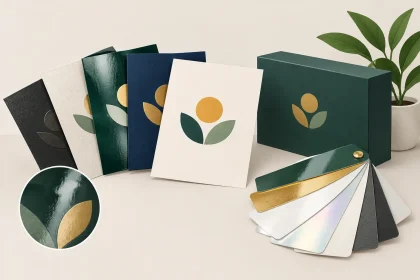
Paper stock also affects colour. A glossy flyer stock can make photos and colour blocks appear sharper and more vibrant, while an uncoated stock has a softer, more natural finish. Both can look professional. The right option depends on the job: a promotional retail flyer may benefit from punchy colour, while a letterhead or premium appointment card may suit a more understated feel.
Avoid building critical brand elements from very fine lines or tiny reversed text. White text knocked out of a dark background needs enough weight to remain clean and readable. The same applies to light grey type, very small text and narrow rules. What looks elegant at 200 per cent zoom can become difficult to read when printed at actual size.
Check images at their actual size
An image can look crisp on screen but still be too small for print. This is because web images are often saved at low resolution for faster loading. Enlarging a small image does not create extra detail. It can make faces, product photos and logos look soft or pixelated.
Place images at 100 per cent of their intended print size and check their effective resolution. For most printed collateral, 300 dpi is the target. If you are producing a large pull-up banner, viewers stand further away, so the ideal resolution can vary. Even then, starting with the best available image gives you a cleaner result.
Logos deserve particular care. Where possible, use a vector logo file such as an AI, EPS or print-quality PDF when creating your artwork. Vector files retain sharp edges at different sizes, making them suitable for a small business card logo and a larger event banner. A screenshot of a logo from a website is rarely a good substitute.
Final PDF Checks That Save Time
Once your design is finished, export the PDF using high-quality print settings. If your design program offers a PDF preset for commercial printing or press quality, that is generally a sensible starting point. Include bleed and crop marks only if the product instructions request them. Extra crop marks are not always needed and can cause confusion if they sit outside the expected artwork area.
Open the exported PDF before you upload it. Do not assume the export is perfect because the working design looked right. Check page order, spelling, prices, dates, website addresses and contact numbers. For a double-sided product, confirm the front and back are correctly oriented. This matters on items such as tent cards, folded flyers and double-sided business cards, where one incorrectly rotated page can affect the finished piece.
Zoom in to inspect fine type, then zoom out and view the full layout. The first check catches technical issues; the second tells you whether the design works as a customer will see it. Ask one practical question: can someone understand the main message in a few seconds? If the answer is no, simplifying the layout may have more impact than adding another line of copy.
It is also worth checking overprint settings if your file has been prepared by a designer or uses specialist effects. Overprint can be useful in certain print workflows, but unexpected overprint settings can make objects disappear or alter colours. If you are unsure, flattening transparency during export or asking for an artwork check can be the safer option.
When Your File Needs a Second Look
Not every business has an in-house designer, and not every deadline leaves room to rebuild artwork from scratch. That is normal. The most useful time to ask for help is before an unsuitable file reaches production, not after the job has been printed.
If you only have a Word document, Canva export, JPEG, old printed sample or a low-resolution logo, provide what you have and explain the finished product you need. Some files can be adjusted quickly. Others may need a redesign or a better source image to achieve a professional result. The trade-off is usually between speed, cost and how closely the final product needs to match your original idea.
For example, a basic flyer with a clear layout may only need the correct bleed and a high-quality PDF export. A business card built from a blurry online logo may need more attention, because the logo is the first thing a prospective customer sees. It is better to resolve that issue upfront than accept a result that does not represent your business well.
At iPrint Media, the aim is to make the process practical: supply a press-ready PDF when you can, and ask the print team when you need a hand. A quick artwork check can be the difference between a job that moves straight to print and one that needs avoidable revisions.
Good print starts before the press does. Give your file a calm final review, allow room for the trim and make sure every detail reflects the standard you want customers to associate with your business.