A customer has made it through the door, found the right aisle and is close to buying. Retail point of sale printing is what helps turn that moment of interest into a clear next step. A well-placed counter sign, offer card or window poster can answer the question a customer is already asking: what should I look at, choose or add on?
For Australian retailers, physical print still earns its place because it works where the decision happens. It gives promotions, prices, product benefits and brand messages a visible presence without relying on a customer checking their mobile or remembering an ad they saw last week.
What retail point of sale printing does for a store
Point of sale, often shortened to POS, covers printed materials displayed in and around a retail environment to guide attention and encourage action. It may sit near a register, on a counter, in a shop window, beside a display or at the entrance. The purpose is not simply to decorate the space. It is to make shopping easier and help the right messages stand out.
This can be particularly useful when a business is running a limited offer, introducing a new product range, promoting a service or trying to lift the value of each transaction. A café might use a counter card to promote a breakfast upgrade. A gift shop may use bright sale posters to draw customers towards seasonal stock. A professional service with a reception area could display a simple flyer that explains an additional service customers may not know about.
The best retail printing feels useful rather than pushy. It provides information at the exact point a customer needs it, using clear words and a look that matches the business behind it.
Start with the customer action you want
Before choosing a format or creating artwork, decide what the printed piece needs to achieve. “Promote the business” is too broad to guide a design. A more useful objective might be to move slow stock, announce a new menu item, collect enquiries, explain a package or make an upsell easier for staff to introduce.
One printed piece should generally have one main job. If a counter card needs customers to try a new product, lead with the product, the reason to try it and the price or offer. If a window poster is designed to bring foot traffic inside, make the message readable from a distance. Trying to include every product, service and social media message usually leaves customers with nothing clear to act on.
A practical test is to look at the design for three seconds. Can a person understand what is being offered and what they should do next? If the answer is no, reduce the copy and give the strongest message more room.
Match the format to the location
Placement affects everything from size to paper stock. Materials at a checkout need to be compact, tidy and easy to read at close range. A4 or A3 posters can work well in windows, on walls or near larger displays, where stronger headings and bolder visuals are needed. Flyers are useful when customers need something to take away, such as a service list, a special offer or details for a future visit.
Pull-up banners can make sense for retailers attending markets, pop-up activations or trade events. They give a brand a larger visual presence without taking much effort to transport or set up. For hospitality venues, drink coasters can also carry a promotion directly to the table, where customers have time to notice an offer or scan a short message.
There is no single best format. A promotion that needs broad visibility may need a poster and window display, while a higher-value service may benefit from a polished flyer customers can keep. The right choice depends on where customers pause, how long they have to read and whether they need to take information with them.
Design for real retail conditions
Retail spaces are busy. There may be competing packaging, fluorescent lighting, reflections on glass, people walking past and staff moving stock around. A design that looks balanced on a computer screen can become hard to notice once it is surrounded by real-world distractions.
Use a strong heading, high-contrast colours and a clear hierarchy. Your logo matters, but it should not be the biggest element unless brand recognition is the campaign objective. For most promotional POS, the offer or customer benefit deserves first position. Think “20% off selected winter stock” rather than a large logo followed by a paragraph of fine print.
Keep body copy short and choose type that remains legible at the intended viewing distance. Light text on a pale image, cramped pricing and overly decorative fonts tend to cause trouble. If legal terms are required, include them, but do not let them overwhelm the message customers actually need to see.
Images should earn their space as well. A sharp product photo can help customers recognise what is being promoted, while a generic image can make a local offer feel less credible. Where possible, use photography that reflects the product, venue or people customers will encounter in store.
Use consistent brand cues
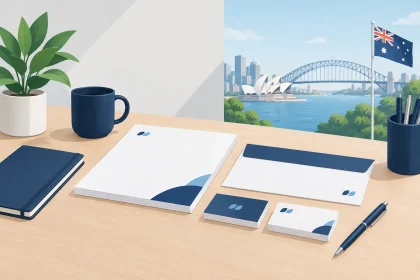
A one-off sale sign may get attention, but a coordinated set of materials builds more trust over time. Use the same logo treatment, colour palette, fonts and tone across posters, flyers, counter cards and take-home pieces. Customers may not consciously notice every detail, but consistency makes the business feel established and considered.
That does not mean every campaign needs to look identical. Seasonal promotions can use brighter colours or new imagery, provided the core brand elements remain recognisable. The goal is a clear campaign with a familiar owner.
Print quality changes the customer impression
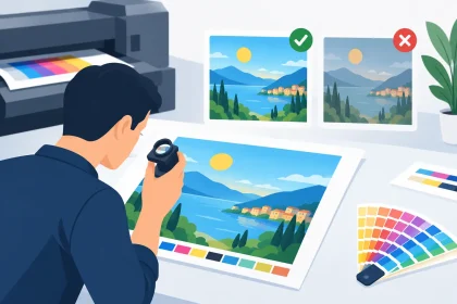
Point of sale printing is handled, viewed up close and placed beside the products you want customers to buy. Thin paper, dull colour or blurry images can unintentionally make an offer feel less valuable. On the other hand, crisp detail and a suitable stock can give even a simple campaign a more professional finish.
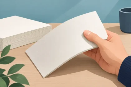
The stock should suit the job. A handout flyer needs to be easy to carry and fold if required. A counter piece may need enough weight to look substantial and stay presentable throughout the promotion. Materials used near food, drinks or frequent handling should be chosen with their environment in mind. Your printer can help confirm suitable options when the finished piece needs to work harder than a standard office printout.
Timing is just as important as the finished look. Retail campaigns often have fixed launch dates, public holiday trading periods or event deadlines. Allow time to check artwork, print and arrange delivery, especially if the materials are travelling to a regional location or multiple stores. Ordering early also gives you room to correct a typo or update a price before production starts.
Prepare artwork to avoid costly hold-ups
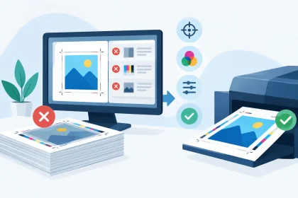
Print-ready artwork helps keep a job moving, but it needs to be prepared for the final size and print process. Supply a high-resolution PDF at the correct dimensions, with images sharp enough for print. If colour runs to the edge of the page, include bleed so trimming does not leave unwanted white edges.
Check phone numbers, pricing, dates and any promotional conditions carefully. These details are easy to overlook after several design revisions, yet they are often the first things a customer needs. It is also worth reviewing the file at 100 per cent size rather than only viewing a reduced preview on screen.
If the artwork is not quite ready, get help before the job goes to print. Fixing a file at the outset is far easier than discovering a low-resolution logo or missing bleed after materials have been produced. iPrint Media can review artwork concerns and help businesses move towards a finished result that represents the brand properly.
Measure what works, then refine it
Retail print is easier to improve when each campaign has a way to be measured. Use a unique offer code, a specific promotional period, a dedicated enquiry question or a simple staff prompt such as “Did you see our in-store offer?” Even basic feedback can show whether a message is being noticed.
Look beyond total sales where possible. A campaign may have succeeded by increasing enquiries, moving a particular line, encouraging repeat visits or making customers aware of a service they had previously missed. If a poster gets attention but does not convert, the issue may be the offer rather than the print. If customers ask questions already answered on the sign, the wording may need to be clearer.
Small adjustments can have a meaningful effect: a larger price, a shorter headline, a better location or a clearer call to action. Treat retail point of sale printing as a practical part of the sales floor, not a one-off design exercise. The best piece is the one that helps your customers decide with confidence while making your business look every bit as professional as the service behind it.